Home Office Paint Colours: Enhancing Productivity and Creativity
- Sep 18, 2021
- 3 min read
Updated: Apr 9, 2024
Creating the ideal home office space is essential for productivity and creativity. While furniture and decor play a crucial role, the paint colours you choose can significantly impact the atmosphere and ambiance of your workspace. In this blog post, we will explore various paint colours that can inspire and invigorate your home office, helping you achieve your professional goals with ease.

How Different Colours Effect our Moods:
Famed colour psychologist Angela Wright developed the Colour Affects System, Angela set out to prove there was a correlation between colours and human behaviour.
In 1984, she wrote the Wright Theory after years of studying colours and their effect on our moods and behaviour.
Psychologists still use her theory today and the Colour Affects System as the benchmark of colour psychology.
Using the 4 Primary Colours, Expert Determined the Following:
Blue: Mind
The colour blue stimulates the mind, leading to more productivity, the hues of the blue colour palette are ideal for staying focused in repetitive industries.
Accounting offices often use blue paint colours to increase productivity and keep their employees focused.
Red: Body
Red evokes a sense of urgency, so for physical jobs like construction and warehousing, red will stimulate workers energy levels.
Yellow: Emotion
Yellow stimulates emotion, which makes it an ideal office colour for creative industries.
It also evokes feelings of happiness and can brighten spirits.
Green: Balance
Green is all about balance, tranquillity, and reassurance, so if you work in the financial industry, green works well as an office paint colour.

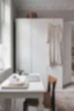
1. Calming Neutrals:
Neutral tones such as light greys, soft beiges, and warm whites create a soothing and calming environment.
These colours provide a clean and serene backdrop, allowing your mind to focus and concentrate on the tasks at hand.
Neutrals also work well with any style or theme, making them a versatile choice for any home office.

2. Energising Blues:
Blue is known for its calming and relaxing properties, making it an excellent choice for a home office.
However, opting for brighter and more vibrant shades of blue can also add an energising touch to your workspace.
Consider shades like teal or turquoise to infuse your office with a refreshing and invigorating vibe.
Try Made x lick Paint offer Blue 01 which I find warm and fresh at the same time.
POSTS RELATED TO HOME OFFICE PAINT COLOUR SCHEMES:

3. Inspiring Greens:
Green is a colour associated with growth, balance, and harmony.
It can create a sense of tranquility and connection to nature, perfect for sparking creativity and inspiration.
Lighter shades of green, such as sage or mint, can create a soothing and refreshing atmosphere, while deeper shades like emerald or forest green can add depth and richness to your home office.

4. Stimulating Yellows:
Yellow is a colour that evokes feelings of happiness, positivity, and optimism.
It can be an excellent choice for those seeking a vibrant and energetic workspace.
Pale yellows can create a soft and warm glow, while brighter shades can add a pop of excitement and enthusiasm to your home office.
Just be mindful of using yellow in moderation, as it can be overpowering if used excessively.

5. Sophisticated Greys:
Grey is a versatile colour that can add a touch of sophistication and elegance to your home office. It provides a neutral base that pairs well with various accent colours and allows your furniture and decor to stand out.
Consider using different shades of grey, such as charcoal or dove grey, to create depth and visual interest in your workspace.
Smog by Graham & Brown is a dark moody grey which gives depth and definition to a home office, creating a distinctive look, like smog on a misty winter's morning.
When it comes to choosing paint colours for your home office, consider the atmosphere you want to create and the emotions you want to evoke. Whether you opt for calming neutrals, energising blues, inspiring greens, stimulating yellows, or sophisticated greys, the right paint colour can enhance productivity, creativity, and overall well-being in your workspace. Experiment with different shades, test them in different lighting conditions, and choose the colours that resonate with you and your work style. With the perfect paint colour, your home office will become a haven of inspiration and productivity, allowing you to thrive in your professional pursuits.
It does not matter on the size of your home office space, you can paint your wall like a pro by downloading my FREE EBOOK GUIDE HERE.


